Most label reprints trace back to a file problem. Wrong color mode, missing bleed, fonts that weren’t outlined, a barcode built in Photoshop instead of Illustrator. These label design best practices exist because the same mistakes show up repeatedly, and every one of them gets caught in prepress review and sends a job back to the designer for corrections, pushing the schedule and frustrating everyone involved.
Following label design best practices from the start eliminates most of that. This post covers the file setup requirements that matter most, what goes wrong when they’re skipped, and what a print-ready label file actually looks like when it arrives at the press.
Label Design Best Practices: Start With CMYK, Not RGB
RGB is a screen color model. Monitors, phones, and televisions use it to display color through combinations of red, green, and blue light. Print uses CMYK, a pigment-based model that layers cyan, magenta, yellow, and black ink. The two color spaces don’t map to each other cleanly. Colors that exist in RGB don’t always have a CMYK equivalent, and the conversion produces color shifts that range from minor to significant.
Neon greens, electric blues, and highly saturated colors suffer most in an RGB-to-CMYK conversion. A brand color that looks correct on screen can print noticeably duller or shift in hue entirely. Setting the document to CMYK before designing is the only way to avoid that. Converting a finished RGB file at the end doesn’t undo color decisions made in the wrong color space.
Get the CMYK values from your brand standards document and build from those. If you’re matching a Pantone color, confirm the CMYK equivalent in the Pantone color bridge rather than relying on a screen representation. For a clear explanation of the difference between RGB and CMYK, Adobe’s color guide is a useful reference.
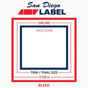
Label Design Best Practices for Bleed, Safe Zones, and Dielines
These three setup elements cause the most file rejections in prepress. Getting them right from the start saves everyone time.
Bleed is the extension of background color and design elements beyond the cut edge of the label. Labels are printed and then die-cut to shape, and mechanical variation determines exactly where the cut lands. Without bleed, that variation produces a thin white edge on finished labels where the cut fell just outside the design boundary. Standard bleed for labels is 0.125 inches on all sides. Any background color, full-bleed image, or edge-to-edge design element needs to extend to the bleed boundary.
Safe zone works in the opposite direction. It’s the area inside the trim edge where critical elements like text, logos, barcodes, and regulatory information should stay. Content placed too close to the trim edge risks partial cutting if the die lands slightly off position. Keep the safe zone between 0.0625 and 0.125 inches inside the trim edge.
Dielines define the cut path for the label shape. A correct dieline sits on its own layer, uses a named spot color, carries no fill, and has overprint set correctly so it doesn’t knock out the design underneath. A dieline on the same layer as design elements creates problems in prepress that take time to untangle. If you’re building a custom shape, get the dieline from your printer before designing around it.
Vector vs Raster: A Core Label Design Best Practice
Labels are small. Sharp edges and soft edges are both visible at label scale in ways that don’t always show on larger formats. Getting the distinction between vector and raster right is one of the most important label design best practices.
Vector artwork is mathematically defined. It scales without quality loss and holds clean edges at any size. Raster artwork is pixel-based with a fixed resolution. Scale it beyond its native resolution and it goes soft or pixelated.
Logos, logotypes, and type should all be vector. A logo submitted as a low-resolution PNG will show in print. Barcodes must be vector without exception. Raster barcodes, even at high resolution, introduce edge softness that affects scan reliability. Build barcodes as vectors, set in 100% black, with no effects, shadows, or color variations applied. Keep the quiet zones clean and unobstructed.
For photographic images, 300 DPI at the final print size is the minimum. An image that’s 300 DPI at a small native size isn’t 300 DPI when scaled up. Check resolution at the size the image will actually print, not the native file size.
Color Management Label Design Best Practices
Rich black vs flat black. Large black fills need a rich black formula to print deep and saturated. Using 100% K alone on a large fill produces a flat, slightly grey result. Ask your printer for their approved rich black build before using it, since the formula varies by printer and substrate. For small black text, use flat K100 only. Rich black on small type causes registration issues that produce blurry text or a visible color fringe.
White ink on specialty substrates. Clear BOPP, metallic films, and similar substrates require a white ink layer as a base. Without it, colors printed on a clear substrate are transparent and the container surface shows through. White ink needs its own layer in the file, clearly labeled, built as a spot color so the RIP handles it correctly. Files submitted for clear BOPP printing without a white ink layer come back for correction.
Spot colors and Pantone matching. Confirm with your printer whether Pantone colors will be printed as spot inks or converted to CMYK. The two processes produce different results with different cost implications. Ask before the file is built, not after.
Finishing Layers: Label Design Best Practices for Foil, Spot UV, and Emboss
Decorative finishes need their own layers in the file. Set each one up as a spot color, correctly named, on a dedicated layer, vector only.
Hard edges matter here. Finishing processes aren’t built to handle tonal variation the way ink printing handles gradients. A spot UV layer with a feathered edge prints with an irregular boundary that won’t match the design. Build finishing layers as clean, filled shapes with defined edges.
Multiple finishes each need their own separate layer. Combining them on a single layer creates production confusion and risks misapplication. Name each layer explicitly: “Spot UV,” “Cold Foil,” “Emboss.” Not “Layer 3.”
Barcodes and Regulatory Elements
Barcodes and regulatory information carry functional requirements beyond appearance. They have to work.
Barcodes need to be vector, set in 100% black, with no effects applied. The quiet zone around each barcode must stay clean and free of design elements. Minimum quiet zone size depends on the barcode type and scanner environment. For retail applications, the GS1 general specifications define the requirements.
Regulatory text, including nutrition facts panels, ingredient lists, allergen declarations, and warning language, has minimum font size requirements set by the FDA and where applicable by Prop 65 and GHS. Most required information has a minimum of 1/16 of an inch, measured by the height of a lowercase letter. That minimum applies to the printed label. Set type at its actual print size and check legibility before approving the file.
Unwind Direction
Unwind direction controls which way labels feed off the roll during application. Get it wrong and labels apply upside down or backwards on an automated line. The run becomes unusable.
Your printer or applicator supplier will specify the required unwind direction. Confirm it before building the file layout. Changing unwind direction after the fact requires rotating the entire layout, which affects bleed, dieline orientation, and any element with a fixed position relative to the label edge. Catching it early costs nothing. Catching it late costs time.
Label Design Best Practices: File Packaging and Export Checklist
A complete, correctly packaged file gives the printer everything needed without follow-up requests for missing elements.
Before sending files, confirm the document is set to CMYK. Check that bleed is 0.125 inches on all sides. Outline all fonts. Embed all images at 300 DPI minimum at final print size. Put white ink on its own correctly labeled spot color layer. Place all finishing layers on separate, correctly labeled spot color layers. Set the dieline on its own spot color layer with no fill and correct overprint. Export as PDF/X-1a or package as a native Illustrator file with all links included.
PDF/X-1a is the standard export format for commercial label printing. It flattens transparency, embeds fonts and images, and locks the color profile. It produces the fewest prepress surprises on the receiving end.
Send files for prepress review before the job is scheduled if anything is uncertain. Catching a file problem before a run is on press costs nothing. Catching it after costs time, material, and schedule.
How San Diego Label Handles Prepress
Every file gets reviewed before it goes to press. That includes color mode, bleed, dieline setup, barcode quality, font handling, white ink layer setup on specialty substrates, and finishing layer construction. Problems get flagged and resolved with the customer before the run is approved.
If artwork needs to be built from scratch or rebuilt to meet print specifications, our prepress team handles that. To submit files or request a prepress review before committing to a run, contact us here. For more on how substrate selection affects file setup requirements, see our complete label substrates guide.