Most FDA label design mistakes don’t happen because brands don’t care about compliance. They happen because compliance review gets treated as a final check instead of a built-in part of the design process. By the time a problem gets caught, the artwork is approved, the run is scheduled, and fixing it means starting over.
These are the mistakes we see most often and what actually causes them.
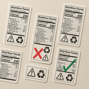
Placing Required Information in the Wrong Location
The FDA distinguishes between the principal display panel and the information panel, and the rules about what goes where are specific. The statement of identity and net quantity go on the principal display panel. The Nutrition Facts panel, ingredient list, allergen declarations, and manufacturer information go on the information panel, which is the panel immediately to the right of the principal display panel as the consumer faces it.
The most common version of this mistake is placing required information wherever it fits in the design rather than where the regulation requires it. A Nutrition Facts panel moved to the back of the package because the designer needed more room on the side is technically non-compliant even if the information itself is accurate. So is an allergen declaration tucked under a flap or placed on the bottom of a container where it isn’t visible at the point of purchase.
Good FDA label design starts with a panel map that establishes where required elements live before any design work happens. Retrofitting compliance into a finished design is harder than building it in from the start.
Font Sizes That Are Technically Present but Non-Compliant
The FDA sets minimum font size requirements for different label elements, and those minimums aren’t fixed numbers. They’re calculated based on the total area of the principal display panel. A font size that meets the minimum on a standard 12-ounce bottle may fall below it on a smaller format of the same product.
This creates a specific problem for brands that resize packaging without going back through the compliance checklist. The artwork scales, the font scales with it, and nobody catches that the scaled-down font is now below the minimum for the new package size. By the time it’s caught, the packaging has often already been produced.
The fix is straightforward: calculate the minimum font size against the principal display panel area for each package size independently rather than assuming a compliant label at one size is compliant at all sizes. The FDA’s nutrition labeling guidance documents the calculation method. The FDA labeling requirements page is the authoritative reference.
Allergen Declarations That Are Incomplete
FALCPA requires clear declaration of the nine major allergens: milk, eggs, fish, shellfish, tree nuts, peanuts, wheat, soybeans, and sesame. The declaration has to be complete, and the most common failure mode isn’t a missing allergen that’s obviously present in the product. It’s a missing allergen that appears as a sub-ingredient.
If your product contains a compound ingredient, like a spice blend or a sauce, and that compound ingredient contains wheat, wheat has to be declared as an allergen even if it doesn’t appear by name anywhere in the main ingredient list. A “Contains” statement that reflects only the top-level ingredients without accounting for sub-ingredients is non-compliant.
The second common failure is using a “Contains” statement inconsistently. If you choose to use a “Contains” statement, it has to reflect every allergen in the product. Declaring some allergens in the ingredient list parenthetically and others in a “Contains” statement while leaving some out entirely is a compliance gap that’s easy to create and hard to catch in a standard design review.
Warning Language That Doesn’t Match Approved Text Exactly
This applies to both FDA-required warnings and Prop 65 warnings. Both have approved safe harbor language, and the protection that safe harbor provides depends on using that language exactly. Paraphrasing, shortening, or rewording approved warning text, even with the same general meaning, removes the safe harbor protection and opens the label to a challenge that the warning was inadequate.
The version of this that shows up most in FDA label design is outdated warning language carried forward from an older version of the label. Regulatory language gets updated. A label that was compliant three years ago may be using warning text that no longer matches current requirements. If you’re updating packaging and pulling copy from a previous label version, every piece of regulatory language should be verified against current requirements, not just assumed to still be valid.
For Prop 65 specifically, the approved warning language and the required warning symbol are maintained at p65warnings.ca.gov. That’s the source to check, not a previous label or a competitor’s packaging.
Wrong Substrate for the Product Environment
A label that passes every compliance check at the design stage can still fail in the field if it’s printed on the wrong material. A Nutrition Facts panel that’s legible on the proof becomes illegible after condensation exposure in a refrigerated case. An allergen declaration printed on an uncoated paper stock smears on contact with moisture. Both are compliance failures even though the design itself was correct.
Material selection has to account for the full lifecycle of the product. Cold storage, moisture exposure, UV exposure, freezer-to-shelf temperature cycling, handling conditions in distribution — all of these affect whether the label remains legible and intact through the product’s service life. FDA durability expectations aren’t separate from material selection. They’re a consequence of it.
If your product faces any environmental stress beyond a dry indoor shelf, the material spec needs to be confirmed against those conditions before the run is approved. A label that works in the lab doesn’t always work in the field. For more on matching materials to environments, see our complete label substrates guide.
No Version Control on Artwork Files
Outdated artwork is one of the most consistent sources of compliance errors we see. A label gets updated to reflect a formula change, a new allergen, or updated regulatory language. The update gets made to one file. Meanwhile, an older version of the artwork is still sitting in a shared folder, still getting sent to print when someone pulls the wrong file.
The consequence isn’t just a wasted run. If the outdated label is missing a required disclosure or carrying superseded warning language, it’s a compliance issue on top of a production issue.
Version control for label artwork needs to be as disciplined as version control for any other regulated document. That means a single source of truth for approved artwork, clear naming conventions that make the current version unambiguous, and a process that requires proof approval against the current version before every run. Not before the first run. Before every run. Regulatory requirements change, formulas change, and package sizes change. The compliance checkpoint needs to happen each time, not once.
How San Diego Label Approaches This
We review files for compliance issues before anything goes to press. That includes checking panel placement, font size calculations, allergen declaration completeness, and material suitability for the product environment. We’re not a regulatory law firm and we don’t provide compliance certifications, but catching a font size error or a misplaced information panel before a run prints costs significantly less than catching it after.
If you’re building a new label or updating existing artwork and want a second set of eyes before you commit to a run, contact us here. For a broader overview of FDA food labeling requirements, see our FDA compliance guide.