BOPP labels — made from biaxially oriented polypropylene — are the most widely used film substrate in label printing, and for good reason. They’re moisture resistant, tear resistant, and durable in ways paper simply can’t match. But BOPP labels come in two distinct versions — clear and white — and the decision between them produces completely different visual results and behaves differently in print production in ways that matter before you commit to a material.
This post covers what each material actually does, where the real differences show up in print and application, and how to think through the decision based on your product and packaging format. For a broader look at how BOPP fits into the full range of substrate options, see our complete label substrates guide.
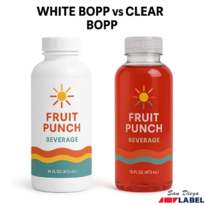
White BOPP Labels: What They Are and When to Use Them
White BOPP is an opaque film with a bright white face. From a print standpoint it behaves similarly to paper — the white background gives ink colors a surface to read against, so what you see in your design file is close to what you get on the finished label. Color accuracy is predictable, contrast is high, and barcodes print cleanly without any additional setup.
The opacity is also what makes white BOPP labels the default choice for compliance-heavy applications. Nutrition facts panels, ingredient lists, lot numbers, and barcodes all require legibility and contrast. On a white background those elements are straightforward. On a clear film they require additional attention to remain readable.
White BOPP labels are available in gloss and matte finishes. Gloss gives you brighter colors and a more standard label appearance. Matte reads as more premium — flatter, softer, and tactilely different in a way that registers on shelf. For food, beverage, and personal care brands where the label is doing significant visual work, the finish choice is worth thinking through as carefully as the substrate itself.
Clear BOPP Labels: What They Are and When to Use Them
Clear BOPP is a transparent film that lets the container surface show through the label. When applied to a glass or clear plastic container, the label appears to be printed directly on the surface — the “no-label look” that premium brands in cosmetics, beverage, and specialty food are frequently after. Done well, it reads as intentional minimalism. The product itself becomes part of the packaging design.
The tradeoff is that clear BOPP labels are significantly more demanding from a print production standpoint than white BOPP labels, and that’s the part that doesn’t always get communicated upfront.
Because there’s no white background behind the ink, colors printed on clear BOPP don’t have a surface to read against — they’re floating on a transparent film over whatever the container looks like underneath. Dark colors on a dark container disappear. Pastels on a light background wash out. Any design element that needs to be legible or color-accurate on a clear BOPP label typically requires a white underprint — a layer of white ink applied beneath the design to create an opaque base for the colors to sit on.
White underprinting adds a production step, affects turnaround, and has cost implications. It also has to be designed intentionally — the underprint layer needs to be part of the file setup, not an afterthought. If you’re bringing a design to a printer expecting a clear BOPP label to look exactly as it does on screen, without a white underprint discussion, you’re likely to be surprised by the result.
How BOPP Labels Behave Differently in Application
Both materials apply the same way and use similar adhesive systems, but there are a few application differences worth knowing.
Clear BOPP labels show fingerprints, adhesive squeeze-out, and application imperfections more readily than white BOPP. On a white background, minor application inconsistencies are hidden by the opacity of the material. On a clear film against a transparent container, they’re visible. If your labels are applied by hand rather than by machine, this matters more than it might seem.
Clear BOPP on a colored or textured container requires more thought about how the background interacts with the design. A clear label on an amber glass bottle will look different from the same label on a clear glass bottle, which will look different again on a white plastic container. The container color becomes part of the label design whether you intend it to or not. This is a feature when planned for and a problem when it isn’t.
White BOPP on a transparent container produces a fully opaque panel wherever the label sits. That’s fine for most applications and often preferred for compliance-heavy labels. But if the product inside the container is part of the visual appeal — a beverage with visible color, a serum with a particular texture — white BOPP covers that entirely.
Print Method Considerations for BOPP Labels
Both clear and white BOPP labels are compatible with digital and flexographic printing, which covers most label printing applications. There are a few process-specific considerations worth noting.
For digital printing on clear BOPP, white underprinting is handled as a spot color layer in the print file. The setup requirements vary by printer, so confirm how your label printer handles this before finalizing the file. Getting the file setup wrong means either reprinting or accepting a result that doesn’t match what you designed. The Flexographic Technical Association maintains resources on file preparation for film substrates that are worth reviewing if you’re setting up clear BOPP files for the first time.
For thermal transfer printing — common in variable data, barcoding, and industrial labeling — white BOPP is the standard choice. Thermal transfer on clear BOPP is possible but requires closer attention to ribbon selection and print settings, and the transparent background creates contrast challenges for barcodes and small text that white BOPP avoids entirely.
For a deeper look at how substrate selection affects print performance across different industries, the Label Printers Association technical library covers film substrate behavior in detail.
When to Use White BOPP Labels
White BOPP is the right call when:
The label carries regulatory information that needs to be clearly legible regardless of container color or surface. Barcodes, lot numbers, nutrition panels, and ingredient lists all perform more reliably on a white background.
The design is color-intensive and color accuracy matters. White BOPP labels produce predictable color output without additional print setup.
The labels are applied by hand in a production or warehouse environment. White BOPP is more forgiving of minor application imperfections.
The container is opaque, colored, or a format where the no-label look isn’t achievable or relevant.
Variable data or thermal transfer printing is involved. White BOPP is the standard substrate for these print methods.
When to Use Clear BOPP Labels
Clear BOPP is the right call when:
The container is clear glass or clear plastic and the no-label look is part of the brand’s visual identity. Cosmetics, specialty beverages, and premium personal care products are the most common applications.
The product inside the container is visually part of the packaging — a colored liquid, a distinctive texture — and you want the label to frame rather than cover it.
The design is intentionally minimal, with limited ink coverage and deliberate use of transparency as a design element.
Your design and prepress process can accommodate white underprint file setup, and you’ve confirmed that capability with your printer before finalizing files.
Still Not Sure Which BOPP Label Is Right for You?
The most reliable way to make this call is to request samples of both materials applied to your actual container before committing to a production run. A clear BOPP label on a container you haven’t tested it on can produce results that are hard to predict from a proof alone. The container color, surface texture, and curvature all affect how the finished label reads.
We can provide samples of both white and clear BOPP labels on your container format before you go to print. If you’re working through this decision and want to talk through the design and print implications, contact us here.