Label Design Best Practices: How to Build Print-Ready Artwork That Actually Prints Correctly
Introduction
Getting label artwork to print correctly starts long before it reaches the press. When designers follow proper label design best practices, the result is cleaner color, sharper details, fewer revisions, and a smoother production process overall.
1. Start With CMYK, Not RGB (Label Design Best Practice #1)
RGB colors cannot fully reproduce in print, which leads to washed-out or inaccurate colors.
Do it right:
-
Set file color profile to CMYK before designing
-
Avoid neon and impossible RGB colors
-
Request LAB or CMYK brand values for accuracy
Outbound link example:
For a clear explanation of CMYK vs RGB, see Adobe’s guide here.
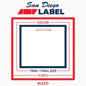
2. Bleed, Safe Zones & Dielines (Core Label Design Best Practices)
Incorrect bleed and poor dieline handling are the top reasons files get rejected.
Standards:
-
Bleed: 0.125″
-
Safe zone: 0.0625″–0.125″
-
Dieline: Spot color, its own layer, labeled correctly
3. Use Vector for Logos, Type & Barcodes
Vectors print sharper, scale perfectly, and don’t pixelate.
Best practices:
-
Logos → vector
-
Barcodes → vector, 100% black, no effects
-
Raster images → 300 DPI minimum
4. Color Management That Prevents Surprises
Poor color handling is a major source of unexpected results on press.
Key label design best practices:
-
Use rich black for large fills (printer-approved formula)
-
Use flat K100 for small type
-
For clear & metallic materials: create a proper white ink layer
5. Finishes: Foil, Spot UV, Emboss & More
Finishing layers require precision.
Best practices:
-
Each finish gets its own layer
-
Vector only
-
Clean boundaries
-
No gradients or soft edges
6. Barcodes, Nutrition Panels & Regulatory Elements
Small details must remain legible after printing.
Rules:
-
Barcodes must be vector + K100
-
Keep quiet zones clean
-
Unless otherwise stated, print size of all required information shall be at least 1/16 of an inch. Print size for mixed lower/upper case letters is based on height of lower case “o”
7. Unwind Direction & Orientation
Wrong unwind direction = unusable labels.
Your printer will specify the required unwind. Confirm it BEFORE designing the layout.
8. File Packaging Checklist (Label Design Best Practices You Should Always Follow)
Before sending files, confirm:
-
CMYK document
-
0.125″ bleed
-
Fonts outlined
-
Images embedded
-
White ink on its own layer
-
Finishes on separate layers
-
Clean dieline
-
Export as PDF/X-1a or AI
Conclusion
Following proper label design best practices eliminates surprises, reduces revision cycles, and ensures your label prints the way you intended. If you need artwork reviewed or rebuilt, San Diego Label’s pre-press team is ready to help.